The visualization of data is the benchmark of modern business intelligence. Let’s dive deep and understand the term data visualization!
Data is the most crucial asset in present times. Various electronic devices all over the world continue to generate massive volumes of variable data. Therefore, enterprises could use the data to understand the behavior of the market. In addition, data can also help in understanding patterns related to certain events.
Talking about patterns, it is easier to find them out in visual data. Therefore, the use of images for understanding information is a reliable option for obtaining detailed insights on a particular process or event. Data visualization offers new opportunities for exploring data from a new perspective.
Also Read: TOP 10 DATA VISUALIZATION TOOLS
Maps and graphs in the 17th century, as well as the invention of the pie chart in the early 1800s, are the earliest data visualization examples. Another prominent example of the use of visual data is the mapping of Napoleon’s invasion of Russia. Charles Minard prepared a map that showcased Napoleon’s army and the path of Napoleon’s retreat — collating the information from this data with time scales and temperature for a better understanding of Napoleon’s retreat.
Today, computers have the power to process massive volumes of data at considerably higher speeds. So, now we have unlimited resources for generating and processing visual data, thereby driving the interest of enterprises in visual data. The following discussion aims at presenting a detailed guide on the visualization of data or data abstraction. The primary highlights of the discussion would include the definition of data visualization, its importance, types, and related tools and techniques.
Defining Data Visualization
The definitions of data visualization or conceptualization vary according to different perspectives. Generally, you can consider it as an effort to anticipate the importance of data by translating it into visual form. Translating data into images helps in finding out the trends, correlations, and patterns that are not visible in text-based data. The modern tools and technologies for visualizing data are highly advanced than the general graphs and charts in Microsoft Excel.
As a result, it is easier to find data represented in multiple sophisticated formats. For example, infographics, heat maps, pie charts, bar charts, and sparklines. These tools for data visualization examples may also have interactive capabilities to provide better flexibility to users for data investigation. In addition, modern tools for visualizing data also provide the facility of indicators that can alert users about data updates. Users can also receive alerts upon the occurrence of any predefined conditions.
Importance of Visualizing Data
How important is it to visualize data? Presently, the visualization of data is the benchmark of modern business intelligence. The majority of modern business intelligence software supports formidable visualization functionalities. Its importance is clearly evident from the fact that 90% of the total data has been created in the last two years.
The World Economic Forum has stated that devices all over the world create around 2.5 quintillion bytes of data on a daily basis. As a result, there is a huge pile of data that is difficult to manage and make some sense out of! Navigating through all lines of data to find out unique patterns and observations is not a suitable task for a single person.
The visualization of data ensures the availability of information, analytics, and data-driven insights to workers across an organization. Generally, the tools for visualization are also easier to use in comparison to conventional statistical analysis software. Visualization tools serve as the ideal fit for the big data trend as businesses need to evaluate the massive volumes of their data quickly and effectively.
Furthermore, the importance of data visualization is also evident in advanced analytics. Visualization tools can help in the visualization of outputs while writing machine learning algorithms or advanced predictive analytics. As a result, data scientists could monitor the outputs effectively and check whether the model is performing correctly. It is obvious that the visualization of complex algorithms is easily understandable in comparison to numerical outputs.
Big Data Analytics is a revolution in the field of Information Technology. Let’s explore why Big Data Analytics is so much important in today’s world!
Tools for Visualizing Data
Let us take a look at some data visualization tools for understanding its importance better. You can consider a business intelligence reporting tool as an example such as Tableau, Power BI, Sisense, etc. Users could configure visualization tools for developing automatic dashboards that can track company performance. These tools have key performance indicators for evaluating performance alongside providing a visual interpretation of results.
The use of data visualization tools in certain business departments is also a reliable example of understating their importance. For example, marketing teams could use visualization tools for monitoring the performance of an email campaign through tracking metrics such as conversion rate, open rate, and click-through rate.
Most important of all, visualization vendors keep introducing advanced functionalities with visualization tools. As a result, visualization tools are becoming integral components in front ends of modern big data environments. The tools can help data scientists in tracking data sources alongside ensuring basic investigative review of data sets before advanced comprehensive analysis.
Therefore, you can clearly notice the massive potential for career development in the field of data visualization.
Types of Data Visualization
The next significant component of this discussion refers to data visualization types. Generally, most people assume that the visualization is all about simple bar graphs and pie charts. Although these tools are a basic part of the visualization of data, it is necessary for pairing the appropriate visualization with the ideal set of information.
- Some of the common types of visualization include charts, tables, infographics, dashboards, maps, and graphs.
- You can also find specific examples for visualization methods such as area charts, heat maps, matrix, Gantt chart, Circle View, Highlight Table, Radial Tree, and Wedge Stack Graph.
- As you can notice, the specific methods pertain to a particular granularity in a given dataset or in-depth presentation of data in new and flexible formats.
Common Data Visualization Techniques
Now, let us take a look at some of the common data visualization techniques such as histograms, bar plots, etc.
-
Bar Plots
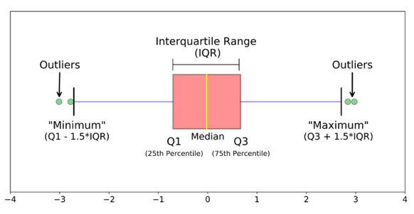
Bar Plots are a technique for graphic representation of different sets of numerical data in quartiles. It is a standard technique for visualizing data distribution on the basis of five factors. The factors are as follows.
- The minimum indicates the minimum value in the dataset.
- First quartile or 25th percentile, which the middle number between the smallest value and median of the dataset.
- Median is the middle value of the dataset.
- Third quartile or 75th percentile, which is the middle number between the median value and the highest value in the dataset.
- The maximum represents the maximum value in the dataset.
The lower and upper quartiles are represented in the form of horizontal lines of the rectangle. The vertical line inside indicates the median value. Here is an image of a box plot.
-
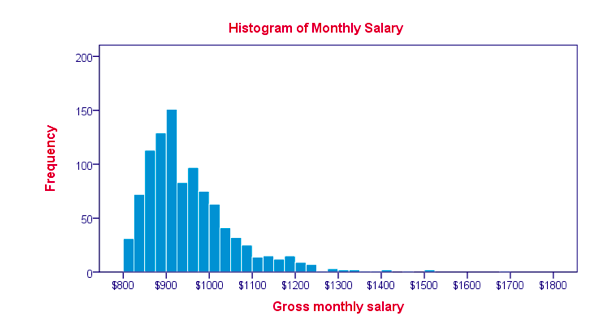
Histograms
Histograms is a reliable technique for representing the distribution of numerical data accurately. It contains bins that are consecutive and non-overlapping intervals for a specific variable. For example, you can see the image of a histogram below.
-
Visualization Charts
Visualization charts are the most important technique for visualizing data. Charts are very simple to create and understand. Visualization charts provide a wide range of options for representing data in the desired manner. Let us take a look at the different types of charts that you can use for visualizing data.
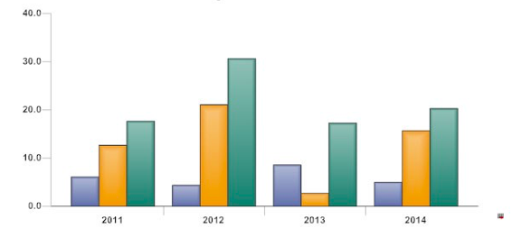
- Simple Bar Chart provides a representation of categorical data in the form of rectangular bars. The heights and lengths of the rectangular bars correspond to the values they represent. Here is an example of a simple bar chart.
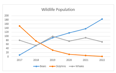
- Line Charts are also a reliable mention among visualization charts. Line charts represent information in the form of a series of data points. The data points are known as markers, and line charts connect the markers with straight-line segments like the following example.
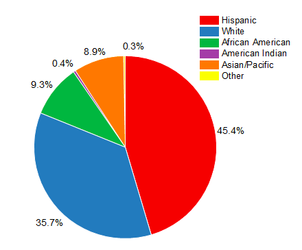
- Pie Charts are also one of the most commonly used techniques for visualizing data, especially in the business world. Pie charts are circular statistical graphs that represent data as slices corresponding to values in a dataset. The arc length of every slide represents the quantity of the particular item in the dataset.
The functionality of data abstraction, visualization, or conceptualization depends largely on the combination of tools, technologies, and skills in the visualization of data. The majority of modern visualization tools have connectors to popular data sources such as common relational databases or cloud storage platforms.
Software for data visualization allows users to understand the nature of data and identify correlations among specific variables. The benefits of visualization tools and techniques include faster comprehension of information and identification of relationships and patterns in large datasets. Businesses could round up on precise target markets and demographics for their offerings with the help of visualization.
Also Read: Most Common Big Data Myths and Facts
Bottom Line
The above-mentioned discussion on data visualization clearly points out the basic components. Awareness of the basics and the best practices for visualizing data can serve a competitive advantage to enterprises. For example, establishing objectives for the visualization of data and selection of the right techniques and tools.
Most important of all, professional training in the visualization of data is essential. You need to understand the data alongside its size and the distinctiveness. In addition, it is also essential to know the audience precisely and their approaches for processing visual information. You can opt for online training courses from reliable training course providers. You can also check out our Tableau basics course, one of the best data visualization tools and learn about data visualization!
- Top 45 Fresher Java Interview Questions - March 9, 2023
- 25 Free Practice Questions – GCP Certified Professional Cloud Architect - December 3, 2021
- 30 Free Questions – Google Cloud Certified Digital Leader Certification Exam - November 24, 2021
- 4 Types of Google Cloud Support Options for You - November 23, 2021
- APACHE STORM (2.2.0) – A Complete Guide - November 22, 2021
- Data Mining Vs Big Data – Find out the Best Differences - November 18, 2021
- Understanding MapReduce in Hadoop – Know how to get started - November 15, 2021
- What is Data Visualization? - October 22, 2021