
Are you stepping into the Power PI platform? Then you must know the Power BI basics. You might get confused on where to get started? or how? To sort out those issues, we come up with some step by step instructions on how to start with Power BI desktop.
Having a thorough understanding of Power BI also helps to pass the PL-900 certification. If you want to be well-versed in business intelligence and analytics, you can take the PL-900 certification.
This article dives you into the basics of Power BI desktop by getting familiarized with importing, transforming, and visualizing the data.
Let’s dive in!
Getting started with the Power BI Desktop
Power BI is a business intelligence and data visualization application that transforms information from many data sources into interactive dashboards and reports. Power BI desktop, Power BI service built on SaaS, and mobile Power BI apps accessible for various platforms are all part of the Power BI package, which offers a variety of products, connectors, and services. Business customers utilise this group of services to gather data and create BI reports.
Also Read: Free Questions on PL-900 Exam Certification
Here are some steps are on how to create interactive reports and dashboards in Power BI desktop:
Step 1: Installation of Power BI Desktop
To start downloading Power BI Desktop, you need to go to the download page of Power BI and choose the download free option. And select the languages you want to download.
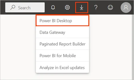
Alternatively, you can also download the Power BI desktop from the services of Power BI.
Now, select the download icon option in the top menu bar and followed by selection of Power BI desktop.
To install Power BI Desktop on your computer, click Get on the Microsoft Storage page and then follow the on-screen instructions. From the Windows Start menu or the icon in the taskbar, launch Power BI Desktop.
Now the Welcome screen appears when Power BI Desktop launches for the first time.
You can get data, view recent sources, access recent reports, open other reports, or choose other links from the welcome screen. To exit the Welcome screen, click the close button.
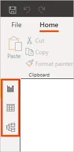
On the left side of Power BI Desktop, there will be three icons for the desktop views such as Report, Data, and Model and it will be placed in top to bottom manner.The yellow bar on the left indicates the current view, and by choosing any of the icons, you can switch between views.
To focus on the group of buttons in the window when using the keyboard, use Ctrl + F6.
Power BI Desktop has options such as Power Query Editor, which will be present in a separate window. And its main function includes, building queries and transforming data, then loading refined data models into Power BI Desktop to make the reports.
Step 2: Connecting to the data
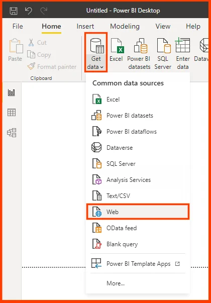
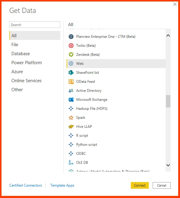
After the installation of Power BI Desktop, you are ready to connect with the data. In order to see the many types of data sources that exist, select Get Data > Click More in Power BI Desktop Home tab, and then go to the Get Data window, check the list of All data sources.
By following the above steps, you can get connected to varied Web data sources.
On the Home tab, choose Get Data > Web to get connected to a web data source. After the selection of the right data sources, the data shaping was carried out to pick only the required amount of data.
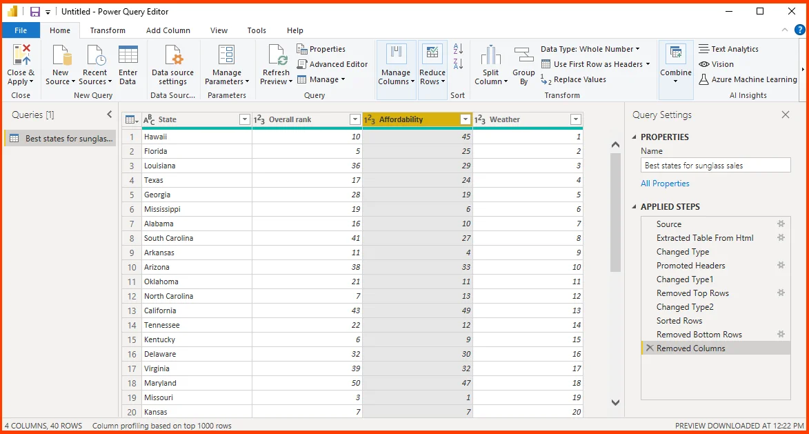
Step 3: Shape data
You may be able to modify the data to meet your needs now that you are connected to a data source. You can use the Power Query Editor detailed instructions for modifying the data while it is loaded and being shown in order to shape it. Only this specific view of the data is affected by shaping and the original data source will be unaffected.
In the power source editor, select each step and confirm preview the table in the Navigator window. Next, you can change type and it is mainly used for detecting whole number data while importing it and changing the original text type into whole numbers automatically.
You can be able to apply your own changes and transformations to the data and see them in the Applied Steps.
The user can be able to select the table that has too much information for your needs, Select the header of each column that has to be removed. Hold down the Shift key to choose several adjacent columns, or else press the Ctrl to select the non-adjacent columns.
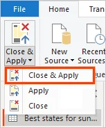
Affordability is completely related to sunglasses sales and thus you need to analyze the column.
On second thought, Affordability might be relevant to sunglasses sales after all. You can repeat the last step in the Applied Steps pane and it can be done by selection of the X delete icon.
Now redo the step, by selecting the columns that need to be deleted. To achieve more flexibility, you can delete each column as a separate step.
Now right-click any step icon in the Applied Steps pane and select delete it, rename it, move it up or down in the sequence, or add or delete steps after it.
For intermediate steps, you will receive warning that changes made could affect the later steps and break the query.
For instance, if you want to sort the table by the factor Weather, you have to delete the Sorted Rows step.And you will receive a warning that deletion may break the query.
After this step, you will be able to remove the bottom 10 rows after that are sorted out by weather. And thus the sorting process can remove the different rows. You also get a warning if you choose the Sorted Rows step and try any intermediate step at this point.
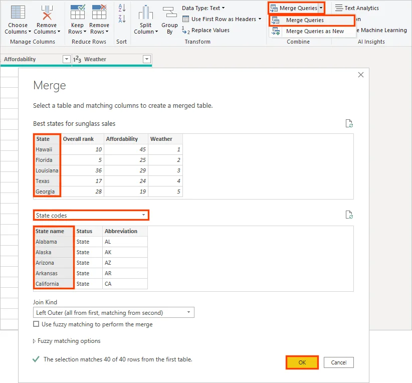
Step 4: Combining the data
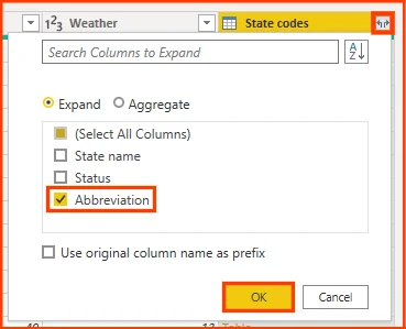
If you want to import data of state abbreviations into the power query editor, the user needs to select a new source and select the web from the New Query group on the Home tab.
In the web dialog box, enter the URL for state abbreviations based sites such as https://en.wikipedia.org/wiki/List_of_U.S._state_abbreviations.
Then you select table codes as well as abbreviations for US states, territories, federal distinct and other regions and then click OK. Now the table appears in the Power Query editor.
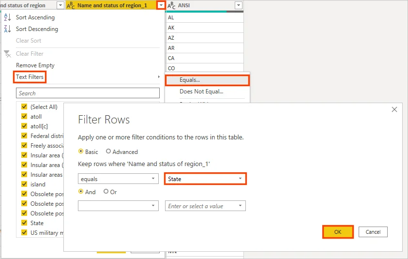
Eliminate all the columns except Name and status of region and ANSI. To retain only those columns, scroll down ctrl and select columns. Then, right click any one of the column header and choose Remove other columns, or in the Manage column groups, select the remove other columns option.
Now drop down arrow next to the icon name and state of region column header and followed by selection of filters > equals.
In filter rows, you can select a valid field in the drop down and then select state. Finally click OK. In the properties field of query settings, rename the table into state codes.
With the shaped state codes table, you can combine the two tables into one.
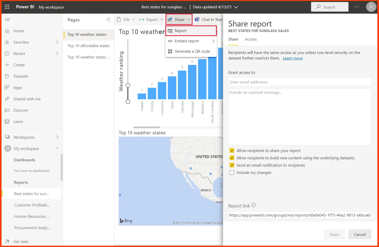
Step 5: Building reports
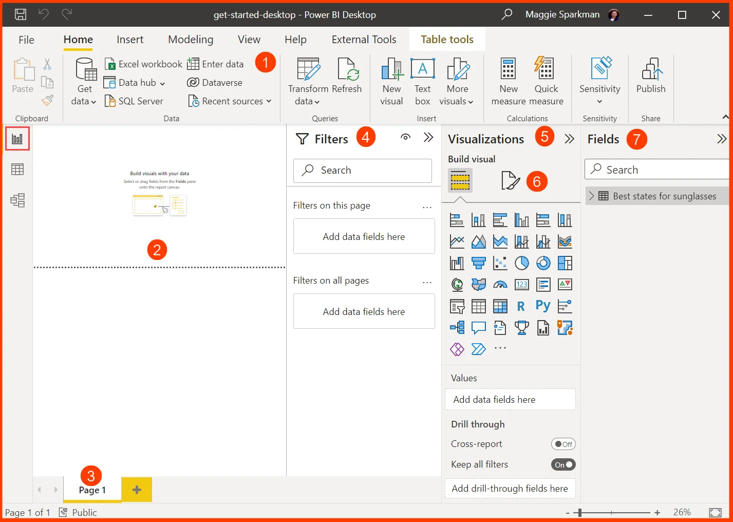
You may create reports and visualizations in the Power BI Desktop Report view. There are six key areas in the Report view:
- The top ribbon, which lists frequent activities related to reporting and visualizations.
- The central canvas area, where you can design and arrange visualizations.
- Choose or add report pages using the pages tab section at the bottom.
- You can filter data visualizations in the Filters window.
- The Visualisations window, where you can apply drillthrough and add, modify, or change visualizations
- You can design the report and visualizations in the Format pane
- The Fields pane, which displays the query fields that are accessible. To create or alter visualizations, drag these inputs into the canvas, the Filters pane, or the Visualisations pane
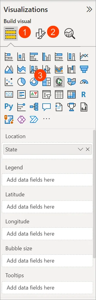
Simply choose any field from the fields list and drag it onto the canvas to create a simple visualization. Drag the State field from the list of the best states for selling sunglasses, for instance, and observe what occurs.
![]()
Power BI Desktop finds out if the State field exists in the geolocation data and created a map-based visualization automatically. The below shown visualization shows data points for the 40 states from the given data model.
The Visualizations pane represents the information about the visualization and you can modify it as per the user needs.
- The Fields option exists in the Visualization pane used to drag data fields into Legend and others into the pane.
- The Format option helps you to apply formatting and some controls to carry out visualizations.
- The icons represent the visualization type created. You can be able to change the visualization type by selecting a various icon, or can be able to form a new visualization by selecting an icon with no visualization chosen.
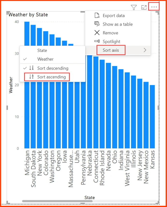
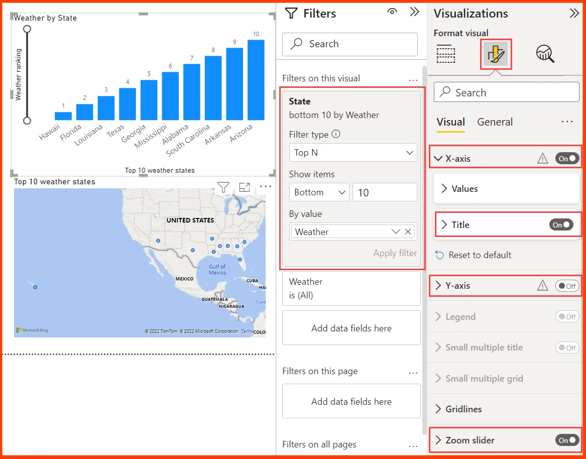
You are also able to filter out the required states with the help of filters pane. Under filter type, scroll down and select top N. In the show items, you can select the bottom in order to show the items which have lowest numerical values and input 10 in the next field.
Now, drag the Weather field from the Fields pane into the value field, and then click on Apply filter.
![]()
Only the top 10 weather states are visible right now in the map visualization.
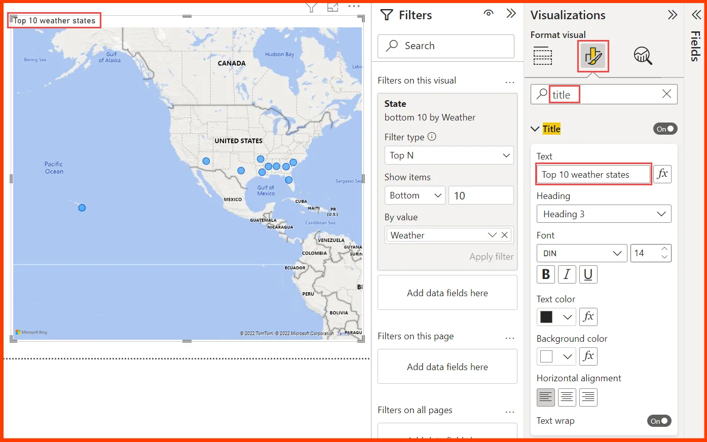
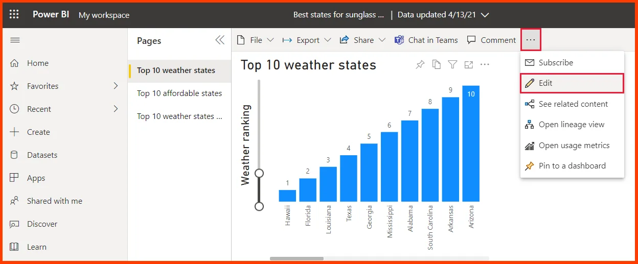
The visualization will have a new title. Enter title in the Search field after selecting the Format icon in the Visualisation window. Enter Top 10 weather states under Text in the Title card.
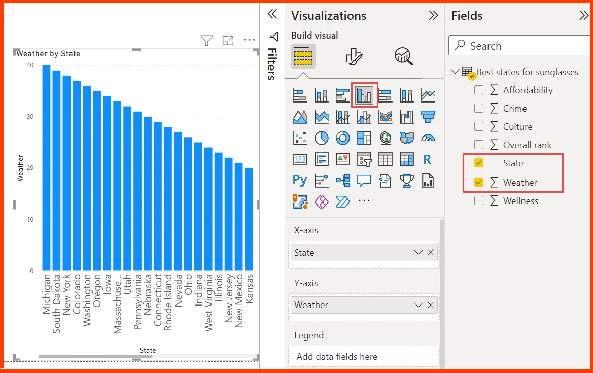
To append visualization that represents the names of the top 10 weather states and that ranks from 1 to 10, choose the blank area of the canvas and then choose the Clustered column chart option from the Visualization pane.
In the Fields pane, choose the State and Weather. A column chart contains the 40 states and it is ranked from highest to lowest numerical rank, or poor to best weather.
On various report pages, you can display alternative visualizations. Choose Insert > New Page from the Home tab of the ribbon or click the + sign next to the already-existing pages on the pages bar to add a new one.
Double-click the page name in the pages bar or right-click it and choose Rename Page; type the new name into the box that appears. Choose the page from the pages bar to navigate to a different report page.
Thus the above steps can helps you to become familiar with the Power BI platform and deepen your knowledge on how to carry out the data visualization.
FAQs
Is it easy to learn Power BI desktop?
Power BI is easy to learn as it is completely based on Microsoft Excel. This makes it easy for anyone to begin using Power BI without requiring experience in data analysis or reporting.
How do I get started with Power BI for free?
You can try Power BI free on websites such as powerbi.microsoft.com and you can find a button showing Try Power BI for free. Or, click an email link that is linked to a Power BI dashboard, report, or app.
Is it possible to use Power BI on a desktop?
Power BI Desktop is a free application software and it can be installed on your local computer and it helps you to connect, transform, and visualize the data. With Power BI Desktop,it is possible to connect to multiple different sources of data, and combine them into a data model.
Conclusion
Hope you are now familiar with the nitty-gritty of Power BI desktop and you can excel the analytics activity with these basic skills.
If you are a newbie, or advanced excel learner, you can take advantage of unique features of Power BI desktop to carry out analytics in an easier way.
If you have any doubts, feel free to contact our experts today!
- A Tour of Google Cloud Hands-on Labs - December 12, 2023
- Mastering Azure Basics: A Deep Dive into AZ-900 Exam Domains - December 4, 2023
- Exploring the Benefits of Validation Feature in Hands-on Labs - October 10, 2023
- 20+ Free MD-102 Exam Questions on Microsoft Endpoint Administrator - September 27, 2023
- 20+ Free MS-102 Exam Questions on Microsoft 365 Administrator Certification - September 25, 2023
- AWS Certified Developer Salary in 2024 - September 19, 2023
- Guide to SharePoint, OneDrive, and Teams External Sharing in Teams - September 10, 2023
- What is Cross-Tenant Synchronization | MS-700 Certification - August 31, 2023